 ASCII
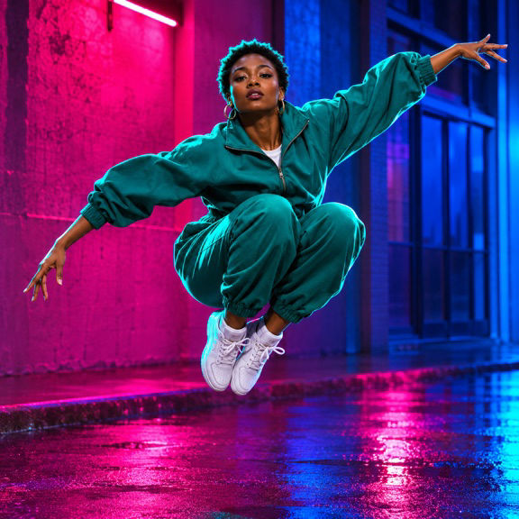
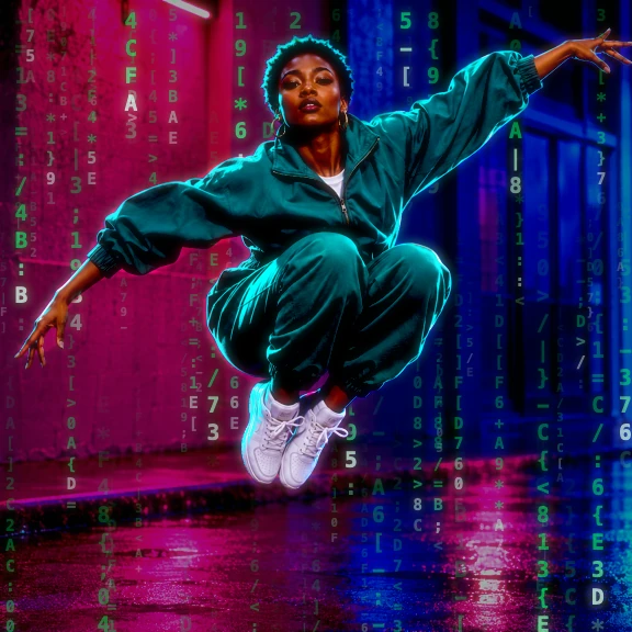
What the effect does

Bright columns fall behind the dancer.

Glyphs stay off the dancer’s clothes.

Dim glyphs carry the rain into shadow.
Make it on iPhone
-
Import
Open your media in ASCII Lab.
-
Tune
Select the effect and check the preview.
-
Export
Choose a format and save your result.
Where to use it


Watch what stays visible beneath the rain
In the alley comparison, the dancer’s raised hand, white sneakers and wet pavement stay in view. The falling columns are easier to see on the walls and between the dancer’s limbs. The original has several strong colors, so the green symbols read as an extra layer against the magenta panel. On a pale background the contrast works differently. Look for a midtone wall or a patch of shadow when you want to show the characters plainly.
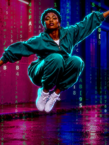
Try footage with a subject separated from the background by light or color. A dancer in a doorway can cross a curtain of symbols with a recognizable silhouette. In a busy street clip, a row of signs can compete with the code, especially if they are nearly the same size as the characters. Crop to the most useful patch of the street and watch the same passage again. The rain can be fairly subtle when the subject fills the whole frame.
Set up the overlay around the source
Choose the crop before judging character size. In a vertical crop, the rows that were out at the edges of a wide frame may disappear, while the central subject becomes much more prominent. If the character field is taking over the eyes or the logo, compare a different density. A coarser field puts fewer, more noticeable marks across the image. A finer field pushes the rain toward texture and can make individual glyphs harder to pick out at small sizes.
Choose the crop before judging character size.
Move brightness and contrast separately. Try to preserve a clean divide between the lit face and its darker surroundings. A single patch of well exposed skin gives you a better reference than a bright sign in the background. If you try glow, check the result at the size where it will be seen. Halos that look tidy in the editor can merge into a pale smear in a feed thumbnail. Prepare a clean export without additional text first if you plan to edit the title elsewhere.
Three places to use falling code
For a Reel, open on the moment the subject crosses a dark part of the background. You can let that movement expose the code between the person and the edge of the crop. Keep the area where the platform draws captions clear enough to read. If you have a clean version of the shot, cutting between the two versions on a beat is often enough to establish the change.
For a cover, look for a still with a strong pose and one uncluttered side. Put the title in that quiet space and use the columns in the opposite half to carry the terminal look. Check the reduced image before choosing your cover. On a small card the rain and a thin font can easily blend together.
For a music video, keep the same crop and playback speed when you export the treated segment. Align it with the clean footage in your editing timeline. A few bars of the overlay can mark a change in the arrangement, and the unaffected sections give viewers time to recognize the location. Check whether you need the source audio before you render.
Questions
Is the matrix rain export transparent?
The comparison shows the overlay rendered with the source frame. For video, the app exports the composited MP4.
Does the overlay require Pro?
Matrix Rain Overlay is a Pro effect. New installs also need active Pro or an eligible active trial after onboarding. Pro exports PNG photos up to 2400 px on the longest side and MP4 selections up to 30 seconds.


